In a move that moves me closer to going fully to DTS (Direct to Screen) I have started to clear out old art files. What a bad chore that would be so much easier if everything was digital only. If you have lots of space like we do (almost 30K s.f.) you tend to save crap and eventually crap must go.
I”m reusing most of the envelopes, recycling the paper, and sending the old films to a company that recovers silver. I’m saving a few things, but mostly being ruthless.
A few things learned:
- There was lots of ugly art 25 years ago.
- We have improved in communicating about artwork, note the colors we were given that were not pantone.
- Stickers fall off, better to write on things that you might keep.
- Hard jobs that caused you great anxiety and rush jobs that kept you worrying all night seem trivial later, so really they were always not worth getting your panties in a bunch about. Remain calm and do the best you can, in the long run it just isn’t worth raising your blood pressure.
-
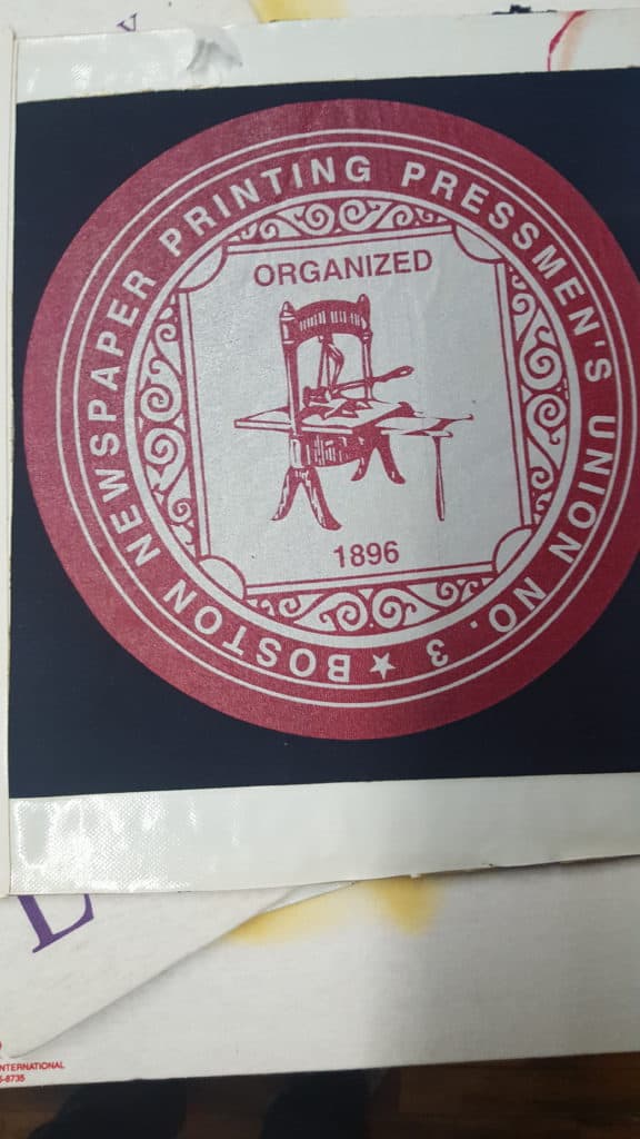
Boston Pressman’s Union made it 100 years 1896 to 1996 but maybe not longer as I see their July 2015 website says, “coming soon.” 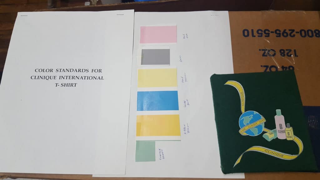
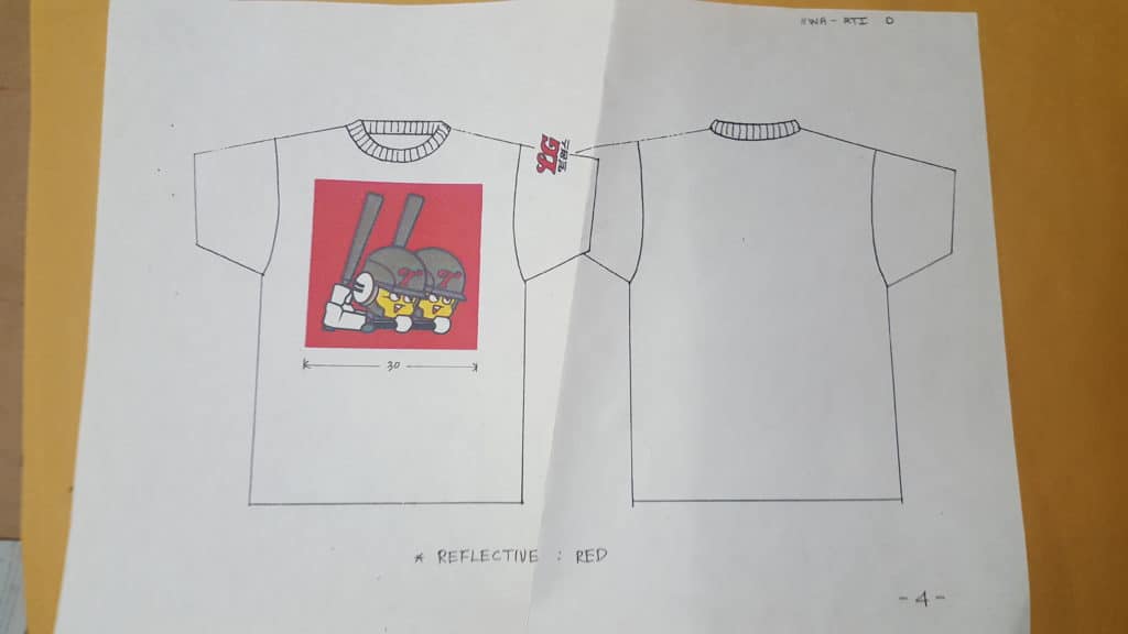
Notice we shown colors to use but no Pantone numbers. 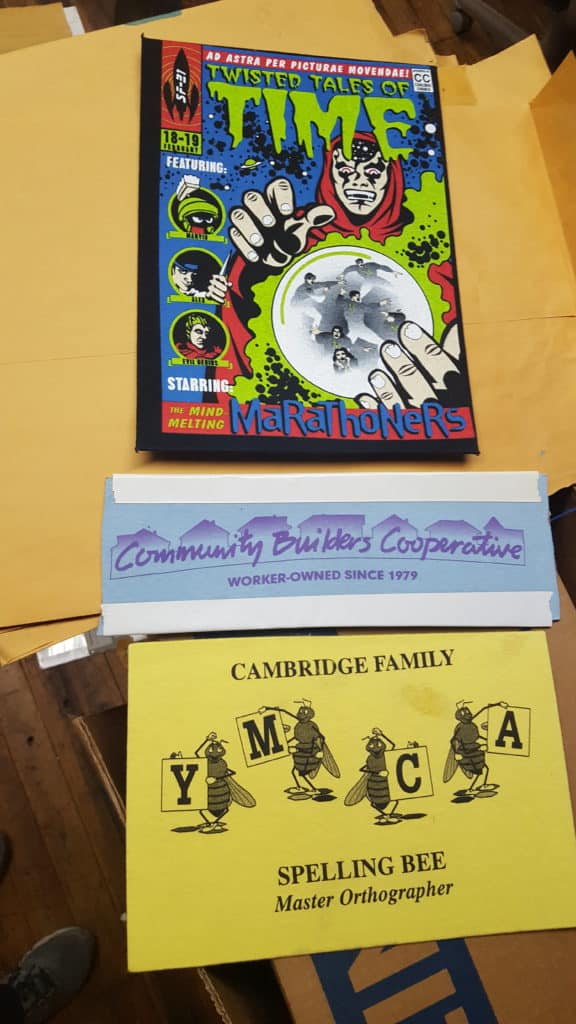
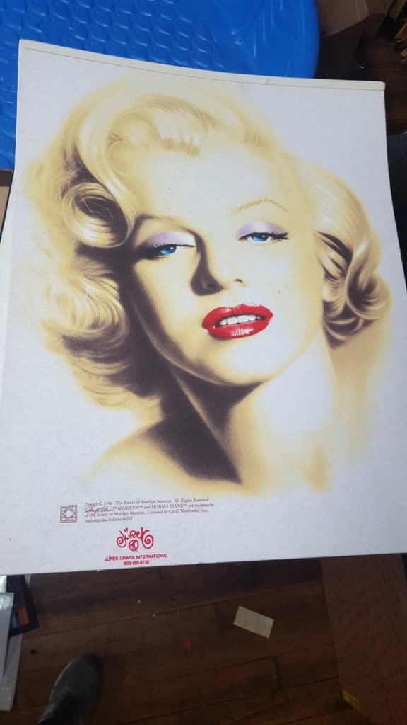
With the inks of 20 years ago, the top image was probably tough to print without build-up. 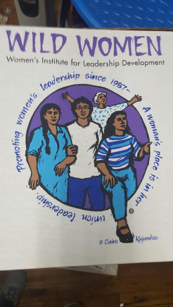
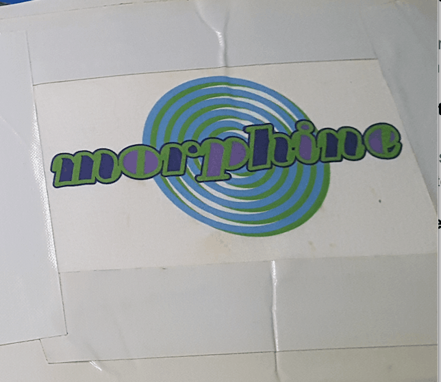
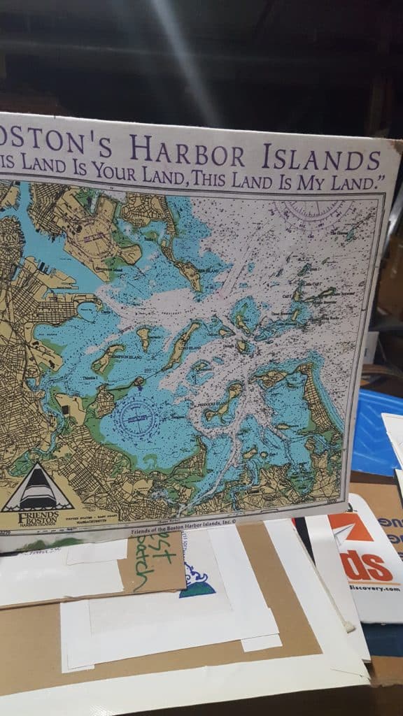
Some art looks pretty dated. 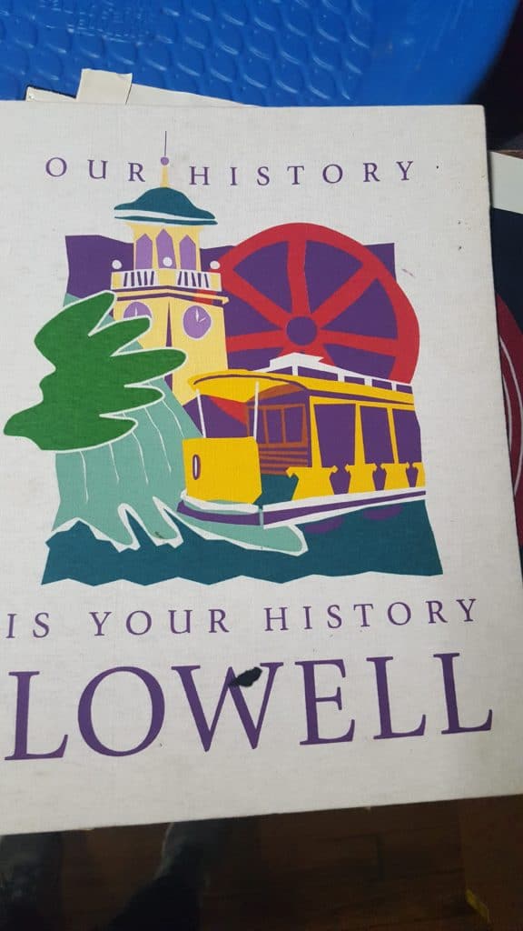
and some art still looks pretty cool. 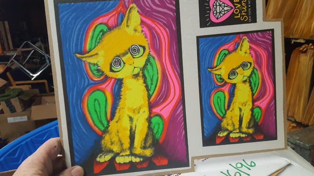
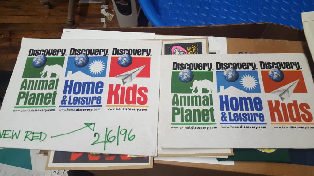

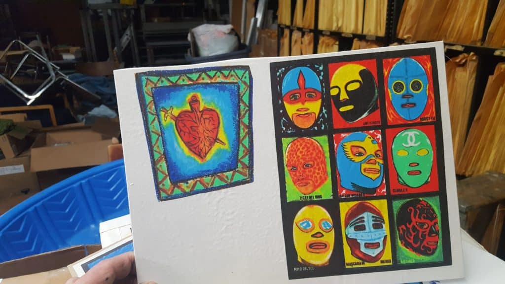
Damn this is hella cool. The discovery channel add Clinique prints are my favorite. Throwing them out or just looking at them?
I’m recycling all that I can (film has silver in it) and throwing the rest out after photos of any samples. We used to run four autos and have most of the films for twenty five years or more.
I’ve been going through the same process. All the way back to hand-cut rubylith artwork. The art got ugly when too much was generated with Quark and early Mac-based type. Please post updates of the move to DTS.
And you definitely have too much room if you have an empty baby pool scattered on the floor!