My buddy KC Hruby has created a few imaginary designs in order to protect the innocent. Today’s subject relates to mock ups of designs and how one must imagine all the folks that might be eventually wearing the shirts. We have run into quite a number of instances where a perfectly innocent design was going to have an unintended look when worn by a real person.
Three real cases happened to us recently:
- We had a nice shirt with an animal on it, but what looked good on a unisex model we put on a real woman, the horns pointed exactly to both nipples, not a good look.
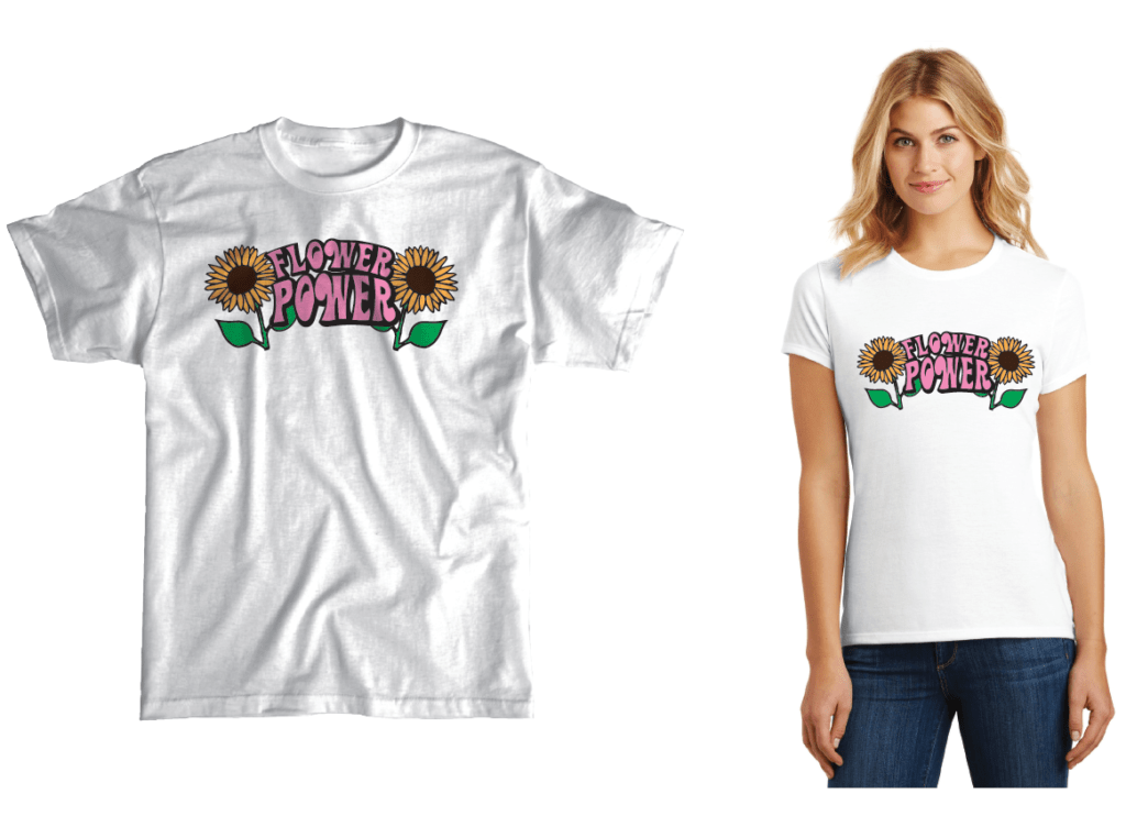
- Same problem with a design with two flowers on it, landing perfectly where they were not intended to.
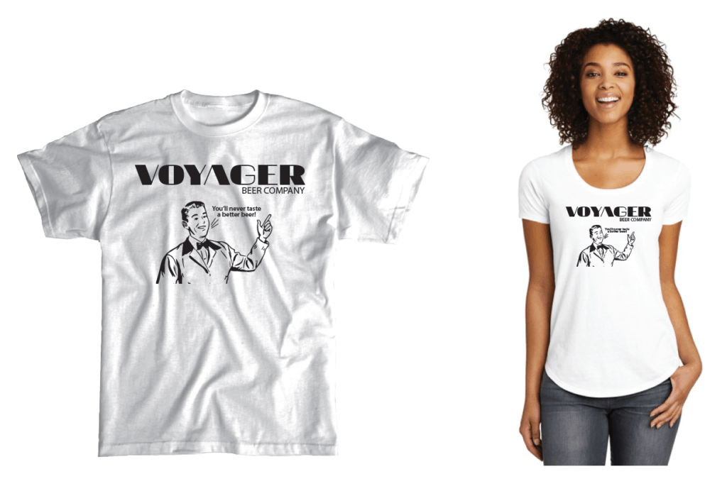
- Then last year we had a design with a large hand with a pointing finger which pointed directly to the breast. It was on a company’s design they had submitted to us. I asked on a call with them, “I have to ask, is that intentional to point at a woman’s breast when she wears it?” Dead silence for a minute..”Oh my God, no! Thank you so much for catching that, we’ll be sending a new design.”
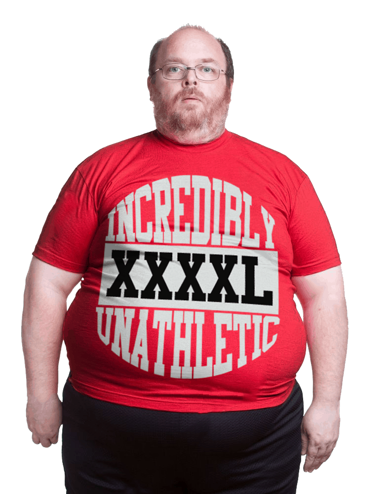
Another bad look is a big circle that falls on the belly, which particularly looks bad on a beer belly.
Imagine your shirts on a real person of all shapes and sizes before you go to press.

Hahaha I would love to submit some of mine. I’ve been noticing this a bunch lately!! A hilarious set-back once you place it on a mock up
There are some funny ones I could not post, really hilarious. If you can, send yours to us and we’ll post them.