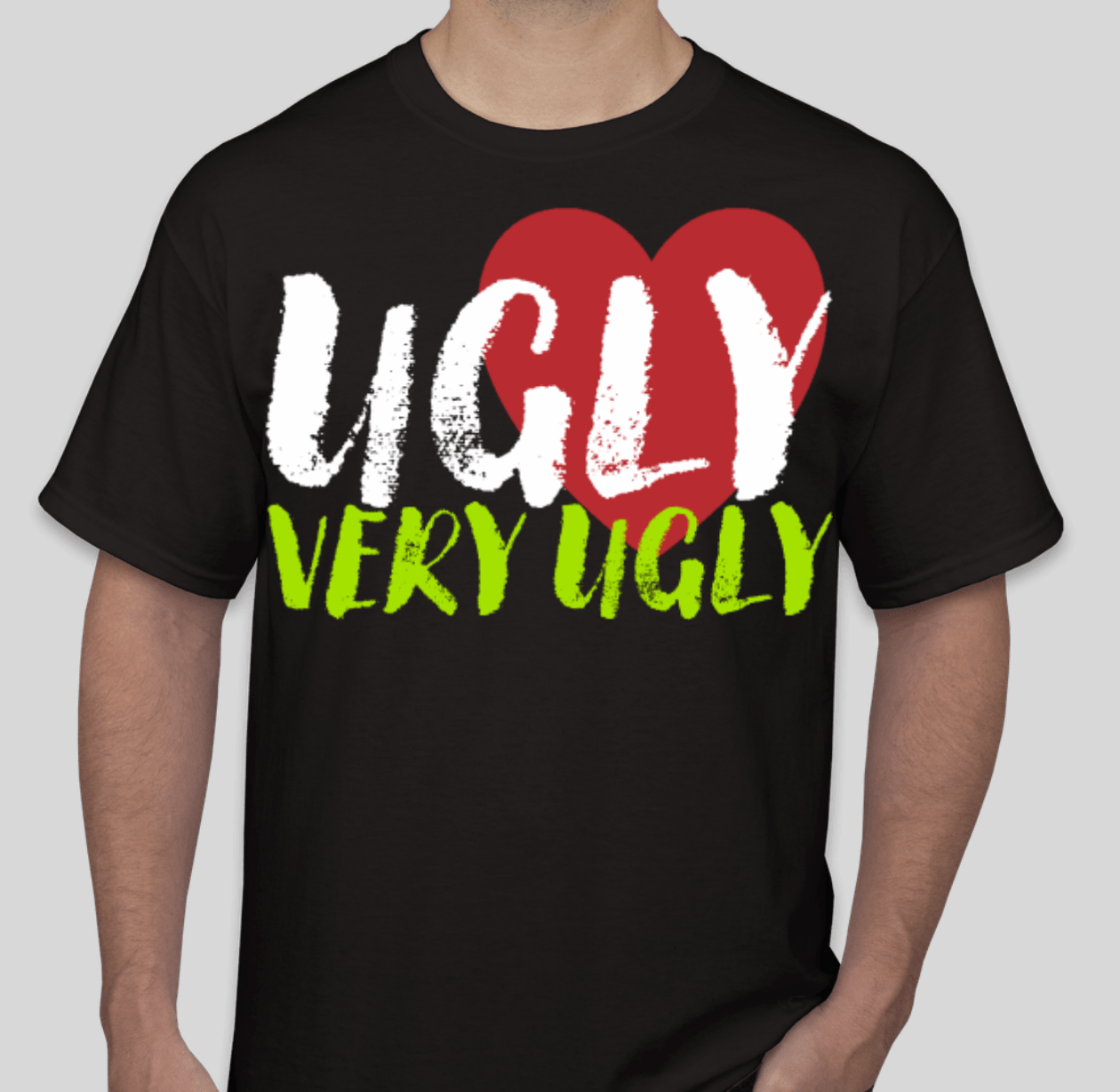
This post isn’t going to have illustration. There are many many possible illustrations for this post, but there is no reason to hurt anyone’s feelings.
Do you want a bad looking t-shirt ? Here are a few pointers:
1. Just design whatever you want and don’t think about what kind of shirt it is going on. It looks good on your screen, you want black shirts, just tell us to print it as drawn. Well… that big mostly white photo on a black t-shirt is going to be a disgusting block of white ink on a black shirt. If we use plastisol ink that will probably make the print bulletproof and who knows, it could save your life in a firefight. However, that still won’t make it attractive. Want an ugly shirt – ignore the fabric, and the color of the shirt, and the style of the shirt.
2. Never mind thinking about what kind of shirt. Don’t even think about it being a shirt. You want a shirt that will be worn or one that will be good for waxing cars ? Shirts are made to be clothing, not for galleries. Reproduce perfectly some attractive and maybe even brilliant graphic from an ad campaign’s billboard on a shirt, and sometimes you have a perfectly awful looking shirt.
3. Use your ignorance and pass it off for originality. If you haven’t printed shirts, you can be seduced by your computer screen to do crazy locations and too many blends. The resulting shirts are either too expensive to print or often just bad looking. Send your printer a mock up of the shirt and the graphic is displayed in a way that the front and back of the shirt are tied in together. The problem is that shirts are rarely ever viewed front and back at the same time and the idea is lost upon anyone but the original designer.
4. Don’t listen. When printers don’t really listen to what the designer wants or designers don’t listen to the printer’s concerns the results of such poor collaboration are unattractive, expensive, and disappointing all around.
5. Be logo police! Above all protect the sanctity of your logo, even if reproduced accurately you end up with a big ugly piece of clothing. Don’t consider putting a smaller version of your legal trademarked logo, just emblazen that inky logo with a color that is out of fashion all over the shirt. The logo works on TV and in print media, so of course it will work on clothing. I personally let my lawyer make all my fashion decisions and I recommend it for all my customers.
6. Don’t bother thinking of your customers. If you like yellow shirts personally, why not everyone ? You saw a giant face with glitter and crystals at some hip shop. That’ll work for the AARP trade show as well, right?
7. Make the shirt as complicated as possible. Make sure you have lots of colors, an intricate design, difficult to reproduce graphics, and print in many locations on the shirt. Just ignore the fact that there seems to be an inverse correlation between how complicated the shirt is and how successful it is. In music if you have more instruments or more notes it doesn’t mean that it sounds better, although it may be more distracting. The same goes for design and more ink and more complicated artwork does not necessarily make a better t-shirt.
There you have it, go make ugly.


It’s all about the notes you don’t play.