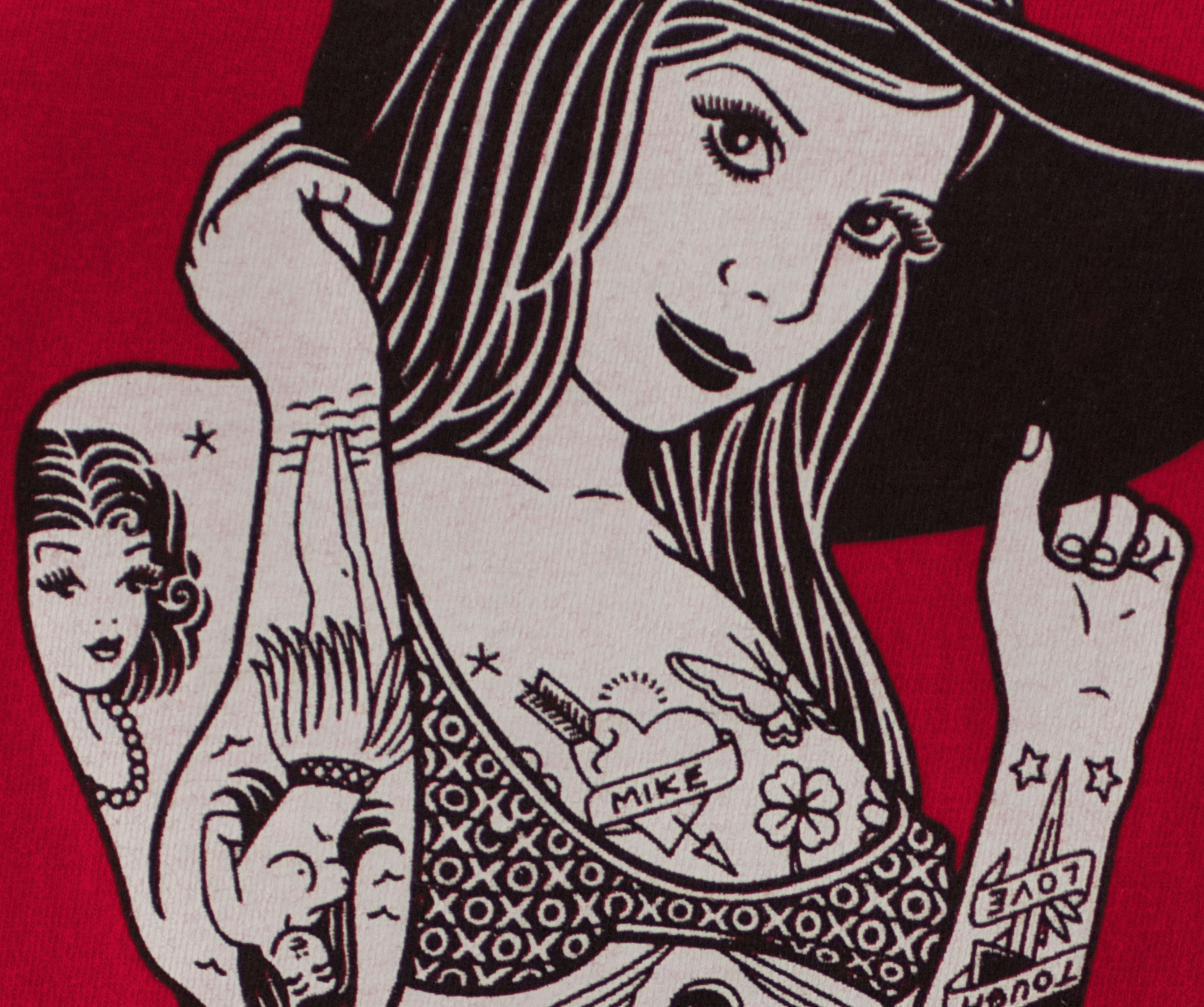
This print was rejected a few years back due to the visible gaps between the black and white lines which allowed the red substrate to show through. In an effort to more reliably hold fine detail throughout a print run we were experimenting with applying strokes of various weight to elements within highly detailed line art prints. We essentially tried to “idiot proof” the artwork for easy printing and went a little, actually, way too far. This was a savvy customer and I have no idea why we didn’t sample as we normally do for retail lines, but he saw it instantly. True, from viewing distance (4-6 ft, isn’t that what the “experts” say?) the print looked great. But my customer’s, and it seems all customers’, idea of “viewing distance” is about 5″ from their face. I tried to convince him that all would be okay in the universe if he accepted the print run but he was having none of it. We had established a certain expectation of quality after printing many similar graphics. We experimented on a production run. The end result was sub-standard. MIS-PRINT! “I can’t have those fucking red lines” is all he said. Pretty hard to argue that.


Comments